Ariel Ximenes
Here is some of my work. If you are interested in seeing more, please contact me.
Reading is Magic
This is a concept project to help encourage youth to read more. With the growing popularity of visual media like movies and television shows, American youths are reading less and less. Reading to and with our children is extremely important. It helps foster relationships, promotes a proficiency in academic performance, and fosters basic speech skills, language mastery, logical thinking skills, and concentration. It is important to teach children the importance of reading at an early age as that knowledge stays with them for the rest of their lives.
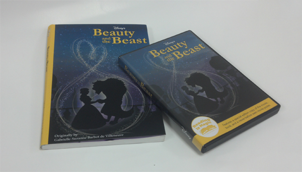
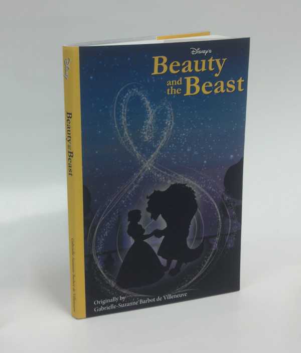
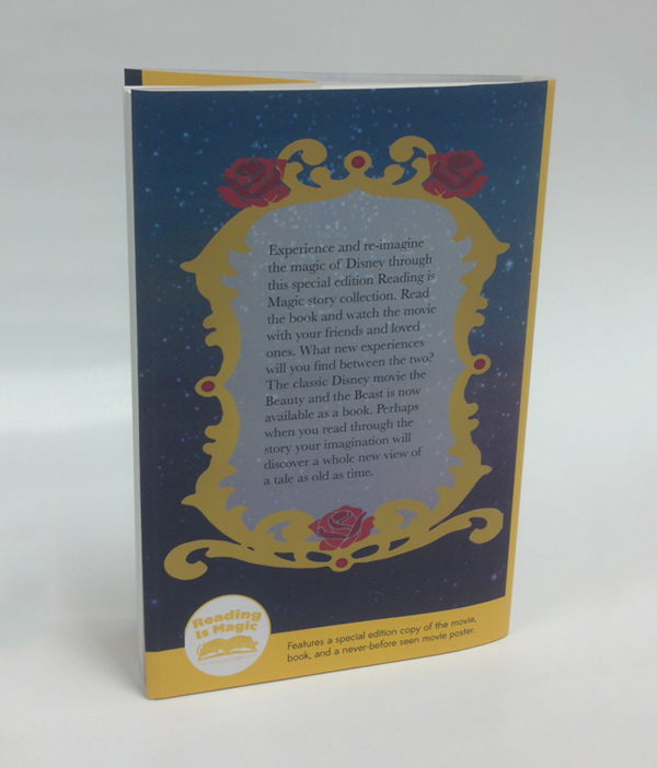
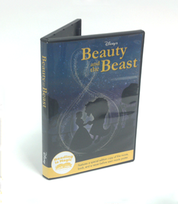
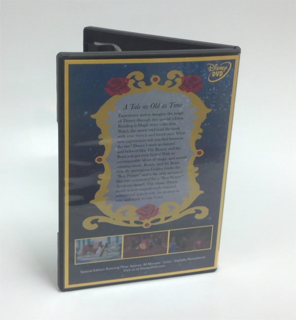
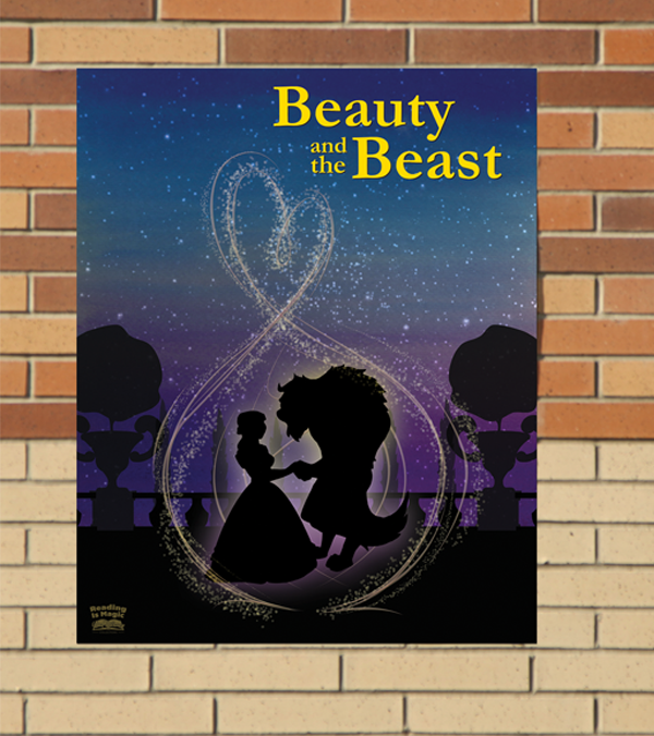
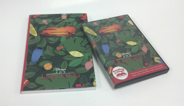
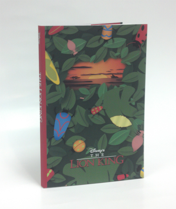
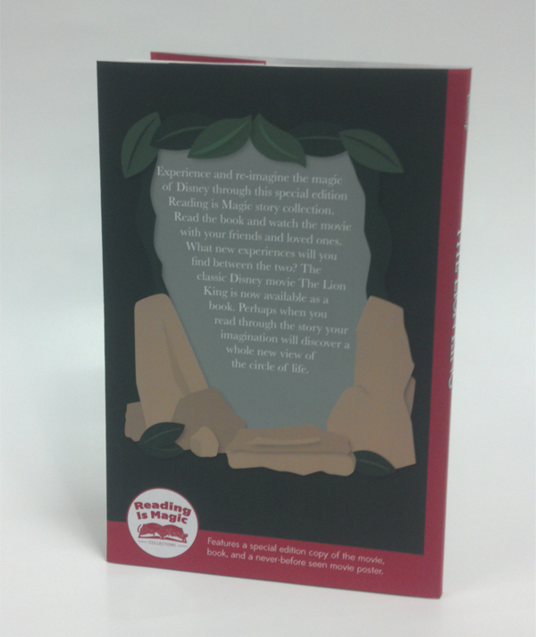
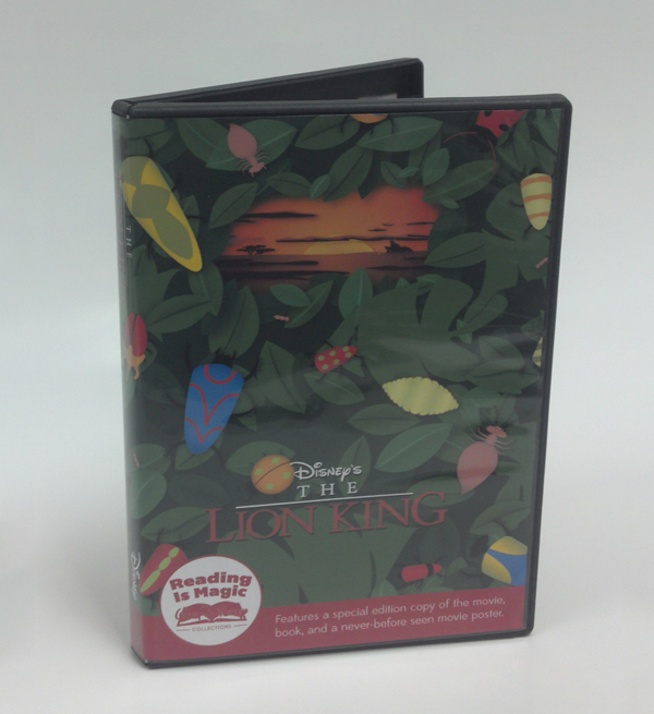
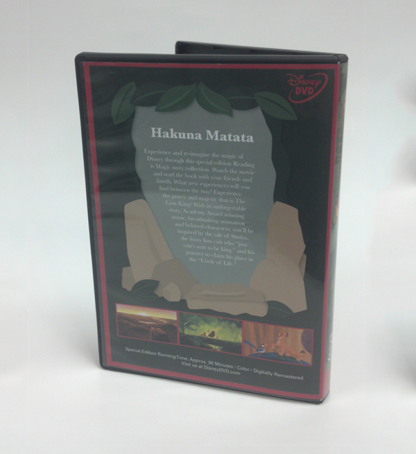
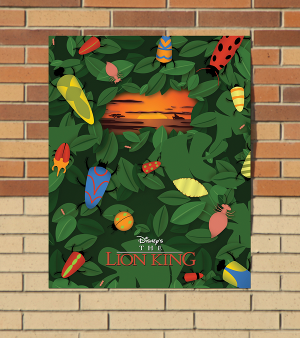
For this special edition campaign, Disney would pair a classic Disney movie with a copy of the story in book form and a matching poster to promote youth to expand their experience and read their favorite stories. The special edition campaign would feature new, matching, stylized-to- the-campaign imagery for the covers of the movie, book, and poster to help illustrate the ability to re-imagine a classic story when you use your imagination while reading a book, as opposed to using the imagery already presented during a movie.
This is meant to be a larger campaign including other classic Disney stories matched to different aged demographics. I started the campaign out with two movies covering their younger target demographics. The Lion King for ages 3-7, and Beauty and the Beast for ages 7-13. The Lion King image features bunch of bugs and leaves, with a window opening up to the Savannah and to Pride Rock. The image is made to be a visual representation of the film’s morals. Simba runs away from his past and learns to live carefree, but eventually must face who is meant to become, eventually learning to meld his carefree and responsible selves to benefit the Pride Lands. For Beauty and the Beast, the image represents the transformation that occurs within the characters Belle and Beast. Beast discovers what it is to love and respect unconditionally, while Belle discovers that looks can be deceiving. Each visual style within the images is also meant to help match to the target demographic. For The Lion King, it is made to resemble cut out pieces collaged and layered on top of each other, to be fun and creative and to be reminiscent of Simba’s time in the jungle with Timon and Pumbaa. Beauty and the Beast is meant to be a much more delicate style calling towards a watercolor washes and silhouettes. The color palettes that I chose for both movies incorporate some of the colors associated with the movies, with variations to match the idea of re-imagining. Yellow and blue are the classic Beauty and the Beast colors, so I used yellow and purple as my leading colors. Similarly, The Lion King is associated with orange and blue, so I focused on greens and oranges. These new palettes pay tribute to the original films, while bringing a freshness to the series that will inspire children of a new generation to realize that reading is magic.
